
Alfred Hitchcock, The Birds, 1963, still from a color film, 119 minutes.
In 1849, when twenty-seven-year-old Gustave Flaubert left Paris for his life-changing trip abroad, his homeland was in the grips of Egyptomania. The fad had invaded the arts, design, and the home decor of the upper classes. For Flaubert, like for many of his fellow Frenchmen, the Orient, as it was often called, was a source of endless fascination, but visiting wouldn’t be easy on his wallet or his waistline. It was an arduous journey: from mail coach to riverboat to railway then finally to a room aboard an ungainly and fragile boat named Le Nil, which was equipped with a sail, a tall funnel, and a pair of paddle wheels. “The ugly little ship staggered the length of the Mediterranean like a drunkard,” writes Geoffery Wall, author of Flaubert: A Life. After eleven days on board Le Nil, Flaubert arrived in Alexandria, where he found himself overwhelmed by the noise of the animals, the scents of the food, and, above all, the colors. “I gobbled up a bellyful of color, like a donkey filling himself with oats,” he writes. In another letter, dated 1850, he compares the country to being alive in “the middle of one of Beethoven’s symphonies … For the first few days, may the devil take me, it’s an astounding hubbub of color, and your poor old imagination, as if it were at a fireworks display, is perpetually dazzled.”
From Alexandra, Flaubert traveled inland to Cairo, where he hopped aboard a Nile cruise. His appetite for color hadn’t been sated, nor had his appetite for Egyptian food—he grew “ignobly plump,” and according to Wall, he took to sleeping fifteen hours a night. When he wasn’t snoozing, Flaubert wrote letters home, many of which would be published years later in a posthumous travel guide to Egypt. Here, he describes the waters of the great river in tones that sweep quickly from prosaic to awestruck:
The water of the Nile is quite yellow; it carries a good deal of soil. One might think of it being weary murmuring the same monotonous complaint that it has traveled too far … As the evening fell, the sky turned all red to the right, all pink to the left. The pyramids of Sakkara stood out sharp and gray against the vermilion backdrop of the horizon. An incandescence glowed in all that part of the sky, drenching it with golden light. On the other bank, to the left, everything was pink; the closer to the earth, the deeper the pink. The pink lifted and paled, becoming yellow, then greenish; then the green itself paled, and almost imperceptible, through white, became the blue which made the vault above our heads, where there was the final melting of the transition (abrupt) between the two great colors.
I love how much Flaubert loves colors. He approaches Joycean levels of color adoration. (Not only does Joyce reference glaucous but also puce, heliotrope, fauve, and jonquil.) But while Flaubert writes glorious descriptions of the Nile, he depicts the mighty river as a variety of different tones—yellow, green, blue. Never once does he discuss the French term inspired by the place itself: eau de Nil.
Eau de Nil (“water of the Nile”) is a tricky color to pin down precisely. It is a light-greenish hue, more saturated than celadon, less gray than sage. It has tan undertones and a cool bluish cast. It is, confusingly, an entirely different color from Nile green. (Another bewildering color, Nile green is defined as a “pale yellow green” by Merriam-Webster, a “pale bluish-green colour” by Collins English Dictionary, and marketed as a bright emerald green by Benjamin Moore.) While the color experts at Pantone do have a green prefaced by Nile, they do not have a single color named eau de Nil. Like the ever-changing waters of Flaubert’s Nile, the color itself changes. Sometimes it is yellowish and springy; other times it is bluish and murky. There is something about “ishy” colors like this that seems to call forth memories more vividly than their primary counterparts. In the introduction to the book Life in Color, the designer Jonathan Adler writes that the “dusty blue-green” eau de Nil “is wartime London. When I see eau de nil, I am transported to the lobby of Claridge’s hotel in London with its signature eau de nil china, its melancholy glamour, its stirring portrait of Winston Churchill framed with an eau de nil border.”

Johann Jakob Frey, Sunset in Cairo, 1846.
Adler is right to locate eau de Nil timewise as a signifier of the early twentieth century. The term first entered our chromatic lexicon in the late nineteenth century, just as Egyptomania was hitting its peak. While in the British Isles talk of “the East” referred primarily to India, France had a particularly strong affinity for Egypt—due in part to Napoleon’s brief 1798 attempts at colonization and the influence of the savants. “If you were French,” Wall writes, “the east was Egypt, a place at the very limit of the European imagination … Egypt was the orient, a country of the mind, a grand theatre of sensuality, despotism, slavery, polygamy, cruelty, mystery and terror.” This Egypt of the mind had little reality outside the poetry of Keats and Shelley; the paintings of Jean-Léon Gérôme, Emile Bernard, and André Duterte (whose painting of the ruined temple at Thebes may have been the basis for “Oxymandias”); and the oddly popular theories of the occultist Helena Blavatsky and her follower, the “wickedest man in the world,” Aleister Crowley. For the French, Egypt as a concept was far more exciting than Egypt as an actual place. (Though not to Flaubert; to him, Egypt was where he bedded nubile young women after watching them dance the popular striptease, “the bee.”)

Alfons Mucha’s Art Nouveau princess from 1911 is surrounded by eau-de-Nil fabric, coral-red blossoms, and cobalt-blue accents. This was the favored color palette of the early twentieth century.
In the decorative arts, including architecture, Egyptomania was longer-lived, and its influence was even more pronounced. While the middle decades of the nineteenth century were dominated by bright, jewel-toned colors (partially due to the invention of aniline dyes, which made these hues more widely available), there was a backlash to all these hypersaturated blues, greens, and reds. “A late 19th-century reaction to the strong, vivid hues came in the form of ivory, pale gray, and other stone colors, ‘greenery-yallery’ (olive green), milky yellows, hyacinth blue, and ‘old rose,’” Judith Miller writes in Classic Style. She argues that this lighter color palette “set the tone” for the ivory-dominated color schemes of Modernist interiors “and the paler colors, such as buff, beige, coffee, eau de Nil” that were often used as accents in these comparatively subdued color schemes.
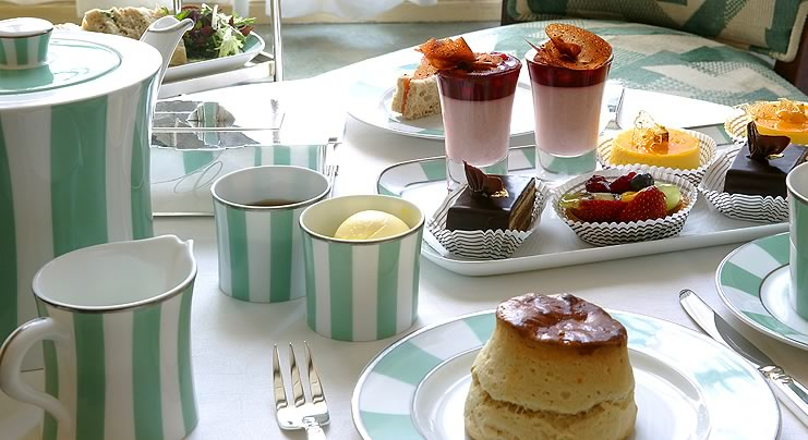
High tea at Claridge’s hotel in London with the eau-de-Nil china set.
Eau de Nil wasn’t just reserved for fine china and expensive wallpaper. It also became a popular color in fashion, worn by both women and men. According to The Grove Encyclopedia of Decorative Arts, the characteristic color palette of Art Deco jewelry was “tango (orange-red), ultramarine, eau de Nil (a pale green), buttercup, lavender, and black,” which was often “expressed in enamel, lacquer or a variety of such materials as jade, ivory, lapis lazuli, stained agate, onyx or jet.” Some of these designs trafficked in Orientalism, including this racist little broach by Georges Fouquet and this hilariously extra Art Nouveau piece that was designed (obviously!) by Alphonse Mucha and made by Fouquet. Unfortunately, this style of jewelry—a “refined mash-up known as art deco Egyptian revival”—remains so highly sought after that many museums can’t afford to purchase the pieces when they come up for auction. (Here are some other examples from Sotheby’s, which neatly illustrate both the over-the-top Egyptian look that was so desired at the time and the blue and green color scheme that was big with 1920s it girls like the six-foot-tall actress Lady Iya Abdy.)
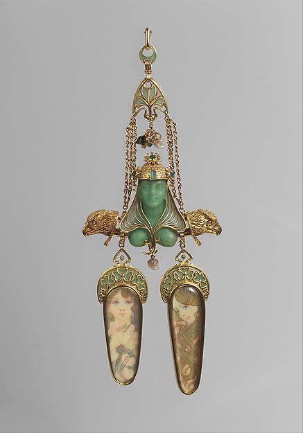
Jewelry designed by Alphonse Mucha, c. 1900. From the Metropolitan Museum’s collection.
As the twentieth century wore on, Egyptomania loosened its stranglehold on high culture, and eau de Nil fell out of favor as a color name, though light green itself remained as popular as ever. Green isn’t a color that ever truly goes out of style, but the preference for muted or highly saturated colors does seem to shift every few years. Similar to how long hemlines sometimes look right or a strong shoulder silhouette can feel so very now, muted colors like eau de Nil or mauve can seem either timeless or incredibly dated, depending on the moment. By the time the 1950s rolled around, eau de Nil was enough of an old hat to appear somewhat classic. It was reportedly Alfred Hitchcock’s favorite shade of green, and he deployed the color strategically. In 1954, Grace Kelly donned an understated and elegant eau-de-Nil suit to play a socialite-model in Rear Window. The suit was the brainchild of legendary costume designer Edith Head, and Hitchcock liked the look so much that he asked Head to replicate it for The Birds. This time, the outfit had “structure more akin to a Chanel suit,” writes Jay Jorgensen in his biography of Head. “Six copies were made of the suit, since Hendren would wear it for a large part of the film, and most would need to be distressed as the birds continued their attack.” Green, Jorgensen notes, “evoked a chaste, cool quality” for Hitchcock, which paired well with his favored type of leading lady (chaste, cool, and blonde).
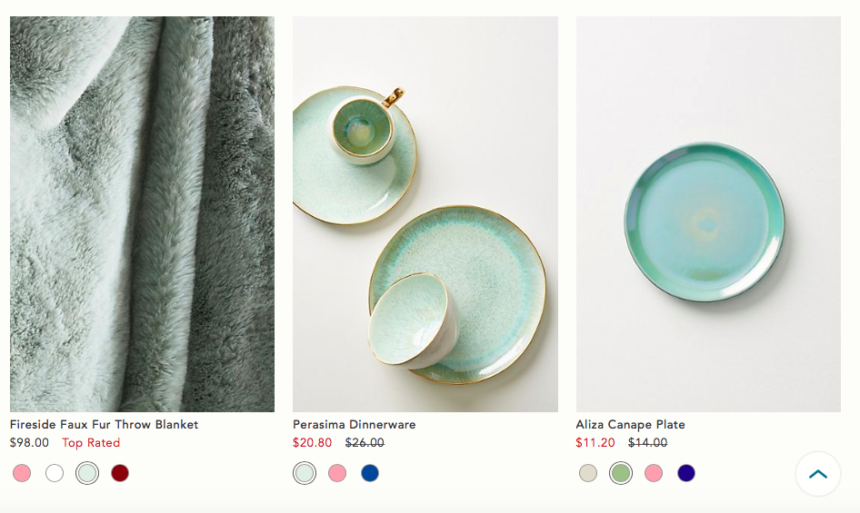
From Anthropologie’s spring 2018 catalog.
While cultural appropriation is not yet a thing of the past, we’ve become increasingly attuned to the damages wrought by artistic pillaging. Egyptomania is most likely never going to come back in style, and good riddance to it. But eau de Nil? I suspect we’re going to be seeing a lot more of that minty green. Pastels are having a moment (first there was the dusty so-called “millennial pink”; now lavender is making a splash), and it would make sense if light green were the next hue to hit the street-style circuit. Green-milk (jadeite) glass has already begun creeping into fashionable kitchens, and Anthropologie’s spring 2018 home collection appears to draw inspiration from the classic color palette of Art Deco jewels, with layers of eau de Nil and seafoam greens, some bright cherry reds and splashes of lavender and cobalt blue. If I were a betting woman (which I am not), I might wager that this time next year, some of us (Rihanna) will be dressing up in eau-de-Nil suits and looking cooler than a nineteenth-century Frenchman cruising down the Nile.
Katy Kelleher is a writer who lives in the woods of rural New England with her two dogs and one husband. She is the author of Handcrafted Maine.
from The Paris Review http://ift.tt/2En9A9k
Comments
Post a Comment