
© Katy Kelleher
Inside the Arthur M. Sackler Art Museum, below a vast glass roof and above a neo-classical series of stone gray columns, hangs a fake painting. It’s a Mark Rothko—or rather, a replica of a Rothko. The canvas is covered in moody indigo and vibrant crimson. It shows a square of color, patchy and imperfect. As the eye moves from left to right, there comes a moment where something changes, the colors diverge. On right side of the piece, the colors are faded, washed pale from exposure to “a very bright light,” as explains Narayan Khandekar, head of the Straus Center for Conservation and Technical Studies at Harvard. On the left side, the colors are vibrant and angry. “This half,” he says, waving one hand around the square of color, “is an exact copy of the Rothko’s painting as it would have appeared to the original owners.”
This replica is an investigative tool, used by the art explorers at Harvard’s research center to help return the Rothko to its former glory. The original work was composed of a series of large violet and vermillion squares, painted on five separate canvases and often referred to as the Rothko Harvard Murals. Harvard commissioned the work in the early 1960s because some within the institution felt that the university “lacked real modern art.” Rothko was honored and excited by the opportunity, and he accepted the commission with one caveat: he didn’t want to be paid for the paintings. “This is the first time I have been able to deliver commissioned work that I am satisfied with,” he said. It was also the first time his work had been displayed at Harvard, and for the former garment district laborer, this felt like quite the coup.
In 1964, the piece was hung in a private dining room on the tenth floor of the newly constructed Holyoke Center (now the Smith Campus Center) on Massachusetts Avenue across from the Harvard Yard. Unfortunately, it was placed on the wall opposite floor-to-ceiling windows. The windows had curtains, certainly, but who likes to sit in a dark room behind drapes to gaze at a painting? The curtains were opened so the diners could see Rothko’s bold colors on one side and the grassy green banks of the Charles River on the other. But light bleached the once-vivid warm reds and intoxicating purples, and by 1967, visible damage had been done. Brushstrokes that were once crimson and violet had turned over time into murky blues polluted with brown and gray. In 1979, the series was removed from view entirely and placed in storage.
It was Rothko’s fault, really. The man liked to mix his own colors. He wasn’t satisfied with out-of-the-tube red or blue or purple. Instead, he mixed ultramarine with lithol red. “We didn’t know Rothko created this mixture before we started looking into sources of the fading,” says Khandekar. “And once we found the mixture he used, we didn’t know what it meant.” With help from colleagues at the Tate in London, Khandekar and his team discovered that lithol red, when mixed with ultramarine blue, created a paint that was less light-stable than either of the colors on their own. Something was happening on a chemical level, altering the paint’s longevity. Rothko couldn’t have known this would happen, nor that it would happen so quickly (twenty years is a very short shelf life for a major work of art). But while previous generations of art restorers would have simply painted over the canvas with fresh blue and new red, that type of irreversible “correction” is no longer standard. Instead, the Harvard labs used their software to calculate the missing color and create a beam of light that would emit from a projection machine, projecting a “map of color” onto the surface of the canvas. “We thought about using something like Google Glass,” Khandekar admits. “But this worked beautifully.” During the time the piece was exhibited this way, a staff member would come at 4 p.m. and turn the projectors off. For an hour, visitors could see the original “(mostly) muddy blacks and grays,” wrote Louis Menard in The New Yorker. For a moment, you could see what time and light can do to beauty; you could come close to loss itself.
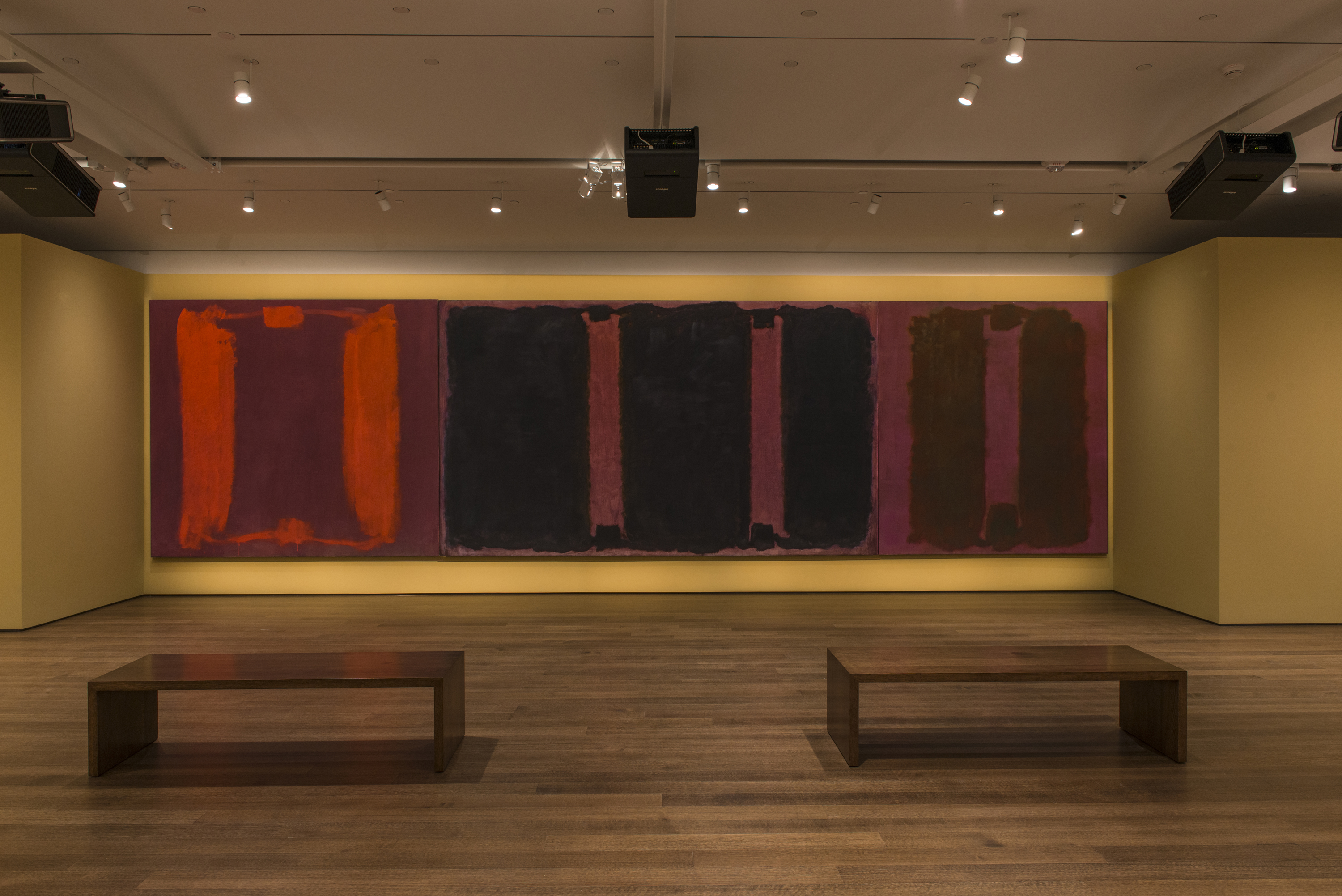
Mark Rothko’s Panel One, Panel Two, and Panel Three (Harvard Mural Triptych), with restored colors using light from digital projectors © 2014 Kate Rothko Prizel and Christopher Rothko / Artists Rights Society (ARS), New York. Photo: Peter Vanderwarker, © President and Fellows of Harvard College.
This is the value of the Harvard pigment library. It’s a space where science and art converge. Each of the pigments, dyes, stones, minerals, and materials stored in these cabinets can be used as a reference tool to help restore and protect great works of art. In her book on the Harvard Fogg Museum, research curator Francesca Brewer called the museum a “laboratory for the fine arts.” With the help of these rainbow bright samples, scientists are able to ward off color loss. They can restore faded pieces through identifying what chemical response caused the fading in the first place. They can also reconstruct stories of paintings and people through an examination of the minerals they used to create their colors and the binding materials that they sourced from nature. The color library is a working laboratory, one that traces the history of color from ancient stones to 21st century nanotubes.
“When we’re looking at a piece of art, we need to be able to understand the choices that were being made, and in order to understand how the pigments were being used, we need standards,” Khandekar explained. “When you see an artist’s paint box, you’re looking at her thinking.” Here, behind glass-fronted cabinets that face outward towards the sunny atrium, Harvard has collected thousands of color samples, and each one offers a little bit of insight into the history of art, color, and creation.
Khandekar is both a scientist and an artist (he likes to paint street scenes in his spare time). On the day we met, he was impeccably dressed in a blue suit. His hair is the type that never seems to fall out of place, and he wears a pair of round wire-rimmed glasses that give him a perpetually curious expression. His deadpan, blink-and-you’ll-miss-it sense of humor shows through as he walks me slowly through the color collection.
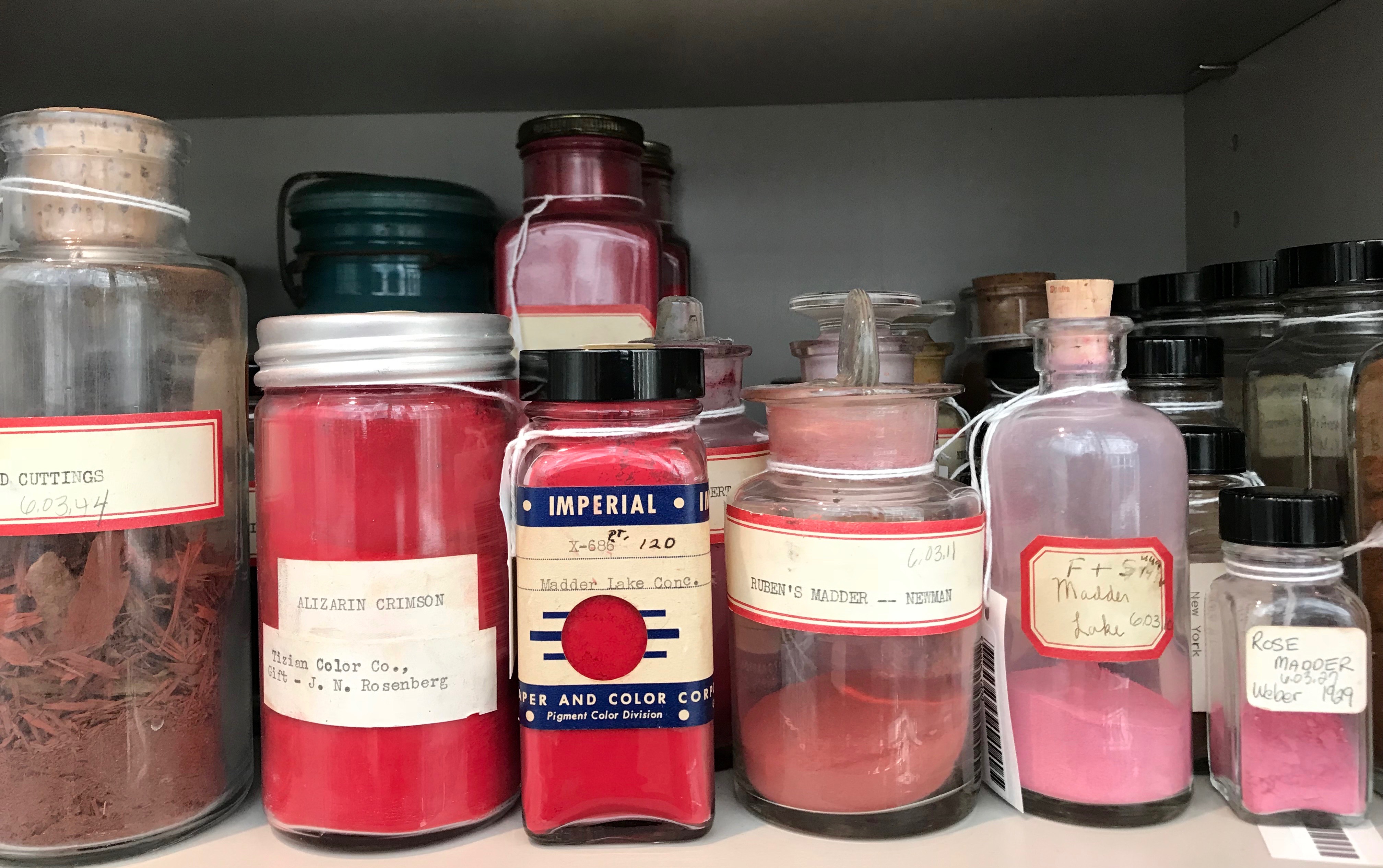
Some of these colors are familiar to me, but most of them are not. Down a long hallway, Khandekar has created a display inspired by the color wheel. As you progress from one end to the other, you move from red to yellow to blue to black. On the bottom shelves, Khandekar has placed the raw materials from which the pigments are derived—ragged pieces of lapis lazuli, a sphere of dirt-brown Indian yellow, chunks of silica, shards of hematite, and a messy wad of dragon’s blood gum (made from the sanguine sap of rattan palms, this bloody maroon was a popular paint during the middle ages). One of the most striking things about the Harvard color library is the sharp contrast between the refined pigments and paints and their raw forms—it’s hard to believe that these brilliant, clear colors ever came from stones, saps, twigs, and leaves. Scattered throughout are highlights of the collection, which was first started by art collector Edward Waldo Forbes (grandson of poet Ralph Waldo Emerson) in the late 19th century and grows yearly as new pigments are added to the store. Here, we see John Singer Sergeant’s paint box, and there, we find a century’s old bladder of paint, paired with ivory pins that were once used to prick holes in the leather so the artist could squeeze out daubs onto their palette.
I love these items because they are beautiful. I am simple like that—easily dazzled by rainbows and swayed by trends. I hadn’t realized how lovely mauve could look on its own, nor how much my eyes craved a bevvy of blues. I could stare all day at viridian, vernalis, and terre verde, mesmerized by the copper emeralds and mineral greens. But Khandekar prizes these samples for a more practical reason. For him, each item in the pigment collection is an important scientific tool. An old batch of verdigris or Prussian blue could unlock the mysteries of a painting or the secrets of a fresco. Towards the end of the interview, I ask Khandekar how much the collection is worth. None of my questions, even the dumb ones, have elicited even an eyebrow raise from him, but this one is different. “I have no idea,” he says. “It doesn’t matter.”

With the help of these pigments, Harvard scientists have restored real Rothkos and uncovered fake Pollocks. In 2002, a New York filmmaker named Alex Matter claimed to have found 32 Pollocks in his late parents’ Long Island boiler room (located not far from where Pollock died in a car accident in 1956). Ellen Landau, an art historian who specializes in Pollock pieces, authenticated the works in 2005. Unfortunately, while the images looked just like Pollock’s pieces, they failed their chemistry exam. According to Harvard researchers, the paintings in question contained red paint that had “only been marketed for a few decades” and a brown paint that was developed in the early 1980s. The binding medium used to create silver paint on one of the pieces was “in all likelihood not commercially available until the 1970s,” read a report released to Reuters. While the Harvard study didn’t come outright and say the paintings were bullshit, it did assert, “some pigments raised questions about the proposed date of creation.” I am not fluent in cautious scientist speak, but I believe this translates to: Nice try, Mr. Matter.
While I practically salivate upon hearing stories of grifters and frauds (particularly now that we’re entering the Summer of Scam), Khandekar prefers to focus on how the pigments can help shine light on previously understudied works, like Aboriginal bark paintings. “I grew up in Australia and I love these things,” he says. “Nobody had given them their due.” Several years ago, he proposed a project that would take him home to Australia, into the outback, where he could collect samples of ochre. (In Australia, all pigment that comes from the earth is termed “ochre.”)
The project is ongoing, but Khandekar has already been able to debunk a few myths. “There had been a narrative constructed, without being proven, that bark paintings were used solely as a temporary shelter. They were painted, but there was no attempt to create longevity.” This turned out to be false—at least in some instances. In bark paintings from the late 19th century, Khandekar found that Aboriginal artists had used orchid juice to bind their pigments. This, he says, suggests the painted bark had more than practical value. “The museum was very supportive,” he says. “It felt gratifying to fill a gap in art history.”
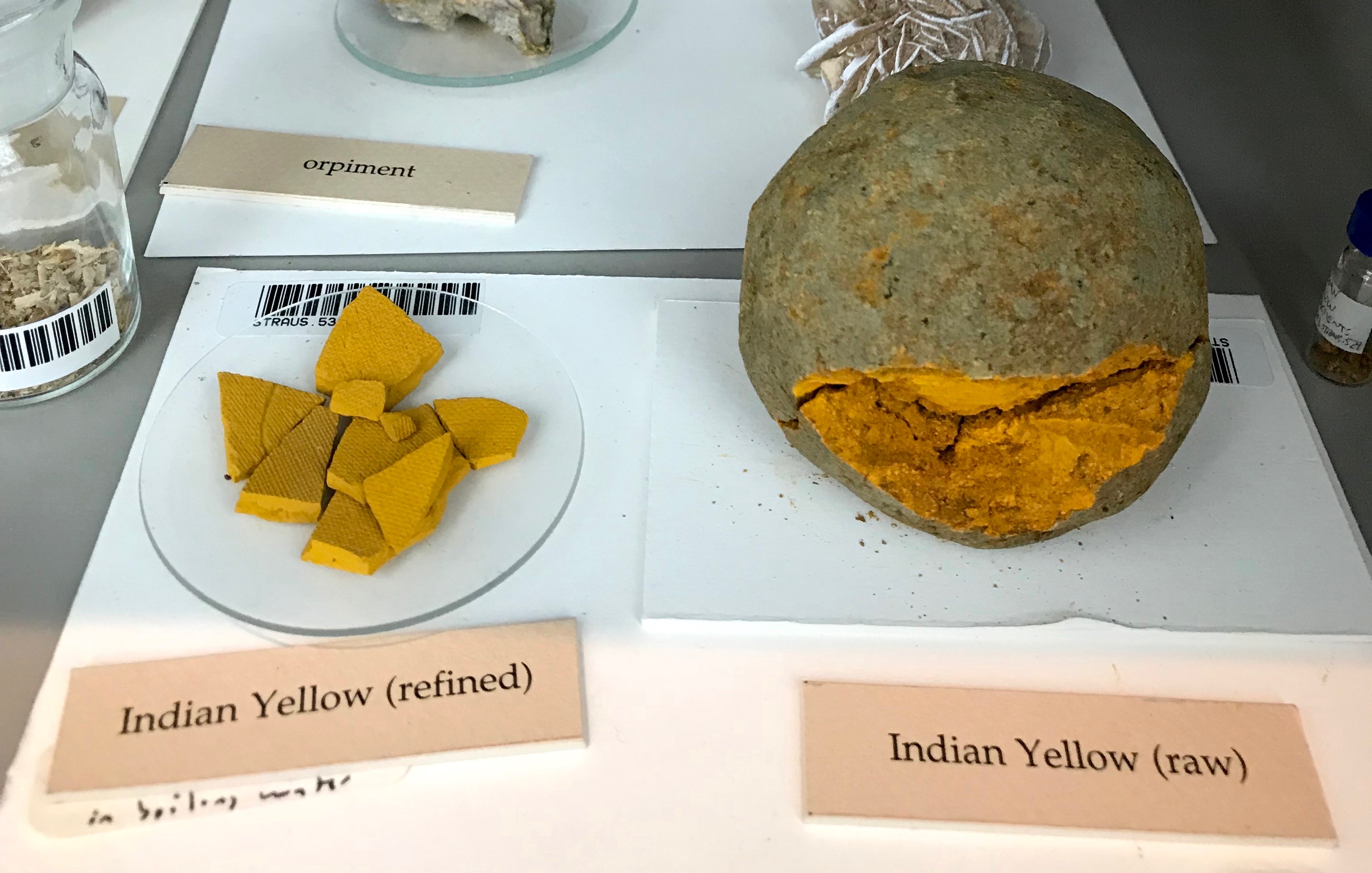
Although Khandekar didn’t work on this project directly, he relays the story of Indian yellow, a pigment that was introduced to India in the 15th century and brought to Europe in the 18th century. According to legend, this vivid yellow paint was made from the urine of cattle that had been fed a strict diet of mango leaves and water, nothing else. As a result, the cows expelled some very highly saturated urine of a remarkable hue—their pee was the sunny yellow of mango flesh. They urinated on the sand, and the paint-makers would collect these dirty yellow balls and knead them until they formed orbs of yellow pigment, like the one on display at Harvard. In the early 2000s, writer Victoria Finlay investigated this claim for her book Color: A Natural History of the Palette. She found little evidence that the paint was made from urine, and concluded that the whole story was likely a myth. “But recently, SUNY Buffalo researchers tested a sample of Indian yellow and found that it contained animal metabolites and plant metabolites,” says Khandekar. “It looks like that story wasn’t as far fetched as it sounds.”
Before I left the pigment library, I asked Khandekar if there were any other myths he wanted to debunk, or any stories he wanted to make sure I told. We had talked about brown paint made from mummy bones and blue paint made from poisonous chemicals, but I knew there were more stories to tell. Yet the one thing Khandekar wanted me to make clear to readers was this: “We’re not open to the public,” he said with a warm smile. “This isn’t storage, and it’s not on public display. I would love to have everyone be able to enjoy them, but then we wouldn’t be able to do our work. And this is our work.” And with that, he went back to his desk, ready, I imagine, to tackle another art history mystery.
Katy Kelleher is a writer who lives in the woods of rural New England with her two dogs and one husband. She is the author of Handcrafted Maine.
from The Paris Review https://ift.tt/2NMt9gg
Comments
Post a Comment