It started with a gunshot. I had just moved into my new house in the woods of Maine, a log-sided cabin surrounded by miles of “public access” forest that were owned by logging companies and managed, as far as I could tell, by no one. It was October, and I was working in my bedroom, with my dog lying heavy on my feet. Suddenly, a shot rang out. It was close. Then another, and another. It was the echoey boom of a shotgun, a sound I’m familiar with, thanks to hours spent skeet shooting under the tutelage of an L2L. Bean instructor in the woods of Freeport. As I listened to the sound of gunfire, I slowly became aware of the stench of urine. My elderly dog, a sweet husky-hound mix named Deja, had pissed all over the floorboards. She was shaking from fear, trembling like an autumn leaf. I didn’t have the heart to discipline her.
This has become an annual occurrence. People trek out into the lumber-land to shoot their guns. I become tense and resentful. Deja pees. And repeat.
I no longer walk outside in the fall without carrying my fear with me. I’m always a little wary of hunters, but I’m more afraid of the drink-and-shoot types. Every year, people die in the woods, hit by stray bullets or mistaken for deer. And so I wear a blaze-orange Carhartt hat. And so my dogs wear orange bandannas around their necks. And so we nail signs to the trees, glowing, neon-orange signs that tell shooters to stay away, keep off our property. I have no way of knowing whether any of this works.
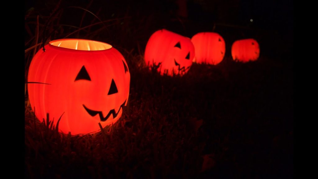
Safety orange is a color I loathe. Also known as blaze orange, it’s a bright, vivid hue. It’s the color of plastic pumpkins (real pumpkins are a little more brown, a little more gray) and candy corn. Blaze orange is a flat color, an artificial color, and the meaning we impose upon it is utterly human. Blaze orange is a warning. It says, “No trespassing.” It says, “Don’t shoot.”
There is something about every shade of orange that feels secondary. This might be because the word orange arrived late into the English language. According to David Scott Kastan and Stephen Farthing, orange is “the only basic color word for which no other word exists in English.” In their new book On Color, Kastan and Farthing explain that while there are many words for red and yellow, there is just one word to describe the color between. “But there was no orange,” they note, “at least before oranges [the fruit] came to Europe.”
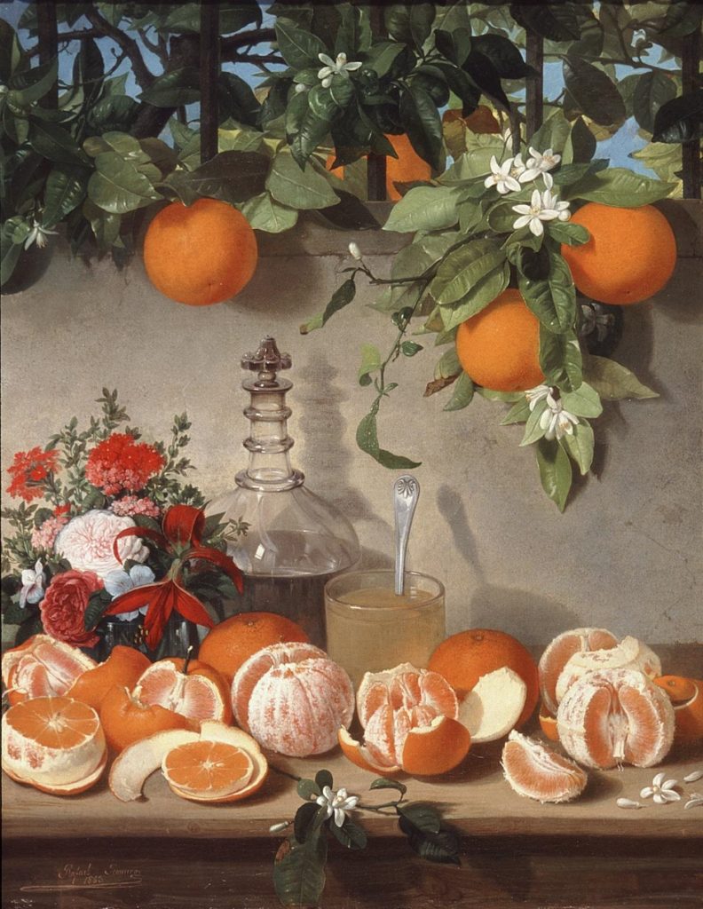
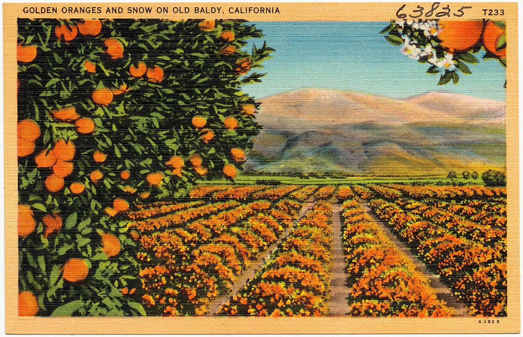
Before the 1500s, people referred to this color as yellow-red. In “The Nun’s Priest’s Tale,” Chaucer refers to a fox as having a color “betwixe yellow and reed.” In the sixteenth century, people had begun to refer to this shade as tawny or orange tawny. It wasn’t until the seventeenth century that orange as a color really took off, and this happened only because Portuguese traders brought the citrus fruit from India to Europe. At first, Europeans “recognized the color but didn’t yet know its name,” explain Kastan and Farthing. “Often, they referred to oranges as ‘golden apples.’ ”
The word spread, as words do, but orange remains an undeveloped color category. While I can think of many words for green—chartreuse, hunter, viridian, lime, jade—I’m hard pressed to come up with as many for orange. There is pumpkin, certainly, but is that a different hue from regular old orange? Tangerine is a bit lighter, and melon lighter still. We tend to shuffle orange-leaning shades into other categories. Ocher belongs to yellow; tomato falls under the umbrella of red. It’s been centuries, and yet we haven’t come to differentiate between that many shades. Although linguists don’t agree on whether a proliferation of color words correlates to an increased ability to see a given color, I do wonder whether my lack of orange-words means I’m also lacking in orange-sight.
Yet this is precisely why we use orange for certain things, like traffic cones and hunting vests. Orange screams at your retinas, spooking them into vigilance. According to a post on the NRA blog, forty-three out of fifty states in the U.S. require hunters to wear blaze orange during the season, noting that “wearing blaze orange is not for the animals, it’s for the people. Deer cannot distinguish the color, but your fellow hunters can.” This has been the standard wisdom since the 1960s, when Field & Stream magazine published a piece titled “Hunter Orange—Your Shield for Safety.” It was the first time the concept of “hunter orange” entered the public discourse. The idea was supported by research conducted by Jack Woolner at Fort Devens, in Massachusetts. “Tested under widely varying lighting and atmospheric conditions over three months, 22,346 sightings by 526 men were analyzed,” explains the journalist Dave Henderson. “In the tests, standard reds appeared black in shadowy areas and disappeared under poor light. It compared to yellow, championed by some hunting groups, which appeared off-white (unfortunately the color of a deer’s tail) early and late in the day.” Green was of course no good, for the obvious reason of leaves, and both blue and purple quickly fade to black when the light is dim. Orange was the only color that made sense, and so Massachusetts became the first state to require that woodsmen don blaze-orange clothing during the fall kill.
Whether you call it safety orange, blaze orange, or hunter orange, the color is the same. Unlike the other shades I’ve researched for this series, this color is government regulated. (The color is sometimes referred to as OSHA orange, in honor of the agency that oversees this sort of thing.) Most hues vary slightly depending on artists’ whims, fashion designers’ vision, or even the decade. (Fuchsia, for example, has brightened considerably over the years, while mauve has faded.) But season after season, blaze orange stays the same. It’s a searing mix of yellow and red. It’s a color you probably see daily yet rarely pause to consider. Do you like it? Most Americans don’t. While yellow is the least common favorite color, orange is the most common least favorite color. People don’t love yellow, but they don’t dislike it the way they despise orange. Orange is polarizing. Orange is divisive.
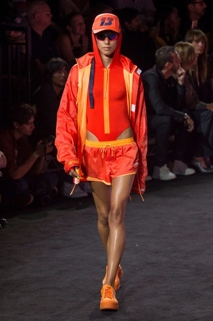
Orange is also fashionable. Every few years, we see leggy models swaddled in bright-orange fabrics strutting down the runway. Like an exclamation mark, it livens up the show, a burst of flat, human-made color that practically glows under the spotlight. Blaze orange feels slightly crass and over the top, a bit juvenile and bratty, reminiscent of the Nickelodeon cartoons of the early nineties. It also reminds me of Egon Schiele’s intertwined lovers, paintings that writhe with the lewd excess of permanent youth. (Schiele died of the flu at age twenty-eight.) I think this is precisely why designers like this angry, horny, intense color. Blaze orange is shocking. It begs viewers to take notice. It’s nostalgic, but in a transgressive way, like trick-or-treating as a newly minted teenager.
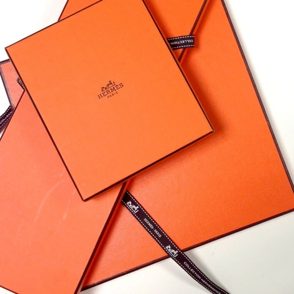
It’s also worth distinguishing, or at least trying to distinguish, between Hermès orange and blaze orange. They’re similar colors, but Hermès orange is slightly less saturated. It veers a little closer to ocher, but the difference is subtle. It’s almost the same hue, just placed in a different context. This is one of the most disturbing aspects of this brilliant shade. I look at Hermès orange—and the orange dresses of Jil Sander Fall 2009 and the fuzzy orange knits of Loewe Spring 2019—and I expect to see something elevated, a better, fancier color than the orange of my acrylic Carhartt hat. These designers are creating expensive garments with the most prized materials in the world, cashmere shorn from mountain-climbing baby goats and leather skinned from newborn bulls. I should see a difference in the colors. And I do, if I look hard enough, but the fact that I want to distinguish fashion orange from hunter orange says something about our culture. Because what would happen if we accepted that Tiffany blue is just turquoise, Hermès orange is just blaze orange, and millennial pink is just rose gold? Would an entire industry come crashing down? Or would it matter not at all? Is context everything when it comes to issues of color and class? The only thing that separates one orange from another is the price tag ($12.99 for this hat, $265 for this key chain), the socially accepted meaning, and perhaps the smallest dash of brown. Hermès orange is luxury; blaze orange is cheap. The difference is nearly imperceptible, but only one of them will keep me from being hit by a hunter’s stray bullet.
Katy Kelleher is a writer who lives in the woods of rural New England with her two dogs and one husband. She is the author of Handcrafted Maine.
from The Paris Review https://ift.tt/2Q92TNR

Comments
Post a Comment