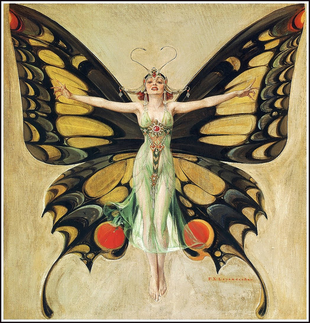
F. X. Leyendecker, The Flapper. 1922
Let me tell you about a color that began as a fabled drink. It tasted harsh and punishing, like medicine. It began as a mythic elixir, and then later became a fashionable green: a color for flappers and Oscar-goers. Some time later, in the minds of many, it mistakenly became red —a deep maroon, the dark color of dried blood. Let me tell you about chartreuse.
But first, pour yourself a glass and watch as the liquid, green as the fresh growth on spring trees, tipples from the bottle. It doesn’t matter if you like the taste. You’re not drinking it for that reason. Chartreuse, like other herbal liquors, is an elixir of life. A cure-all, good for digestion and headaches, for sleeping like an infant and living until you’re 90. Even if you haven’t had Chartreuse, you’ve probably tasted something similar. Italy has Fernet (a favorite of American bartenders for sipping on the clock, or so I’ve heard), Poland has Krupnik, Portugal has Beirão, and Hungary has Unicum (syrupy thick, black and bitter — my personal favorite). These strange drinks still taste of strong magic; it’s easy to imagine that Chartreuse could cure you. It’s no absinthe. There’s no sexy fairy on the bottle, no Mucha-girl grabbing your arm and asking you to dance. There’s only a sickly acid green liquid and a monastic stamp.
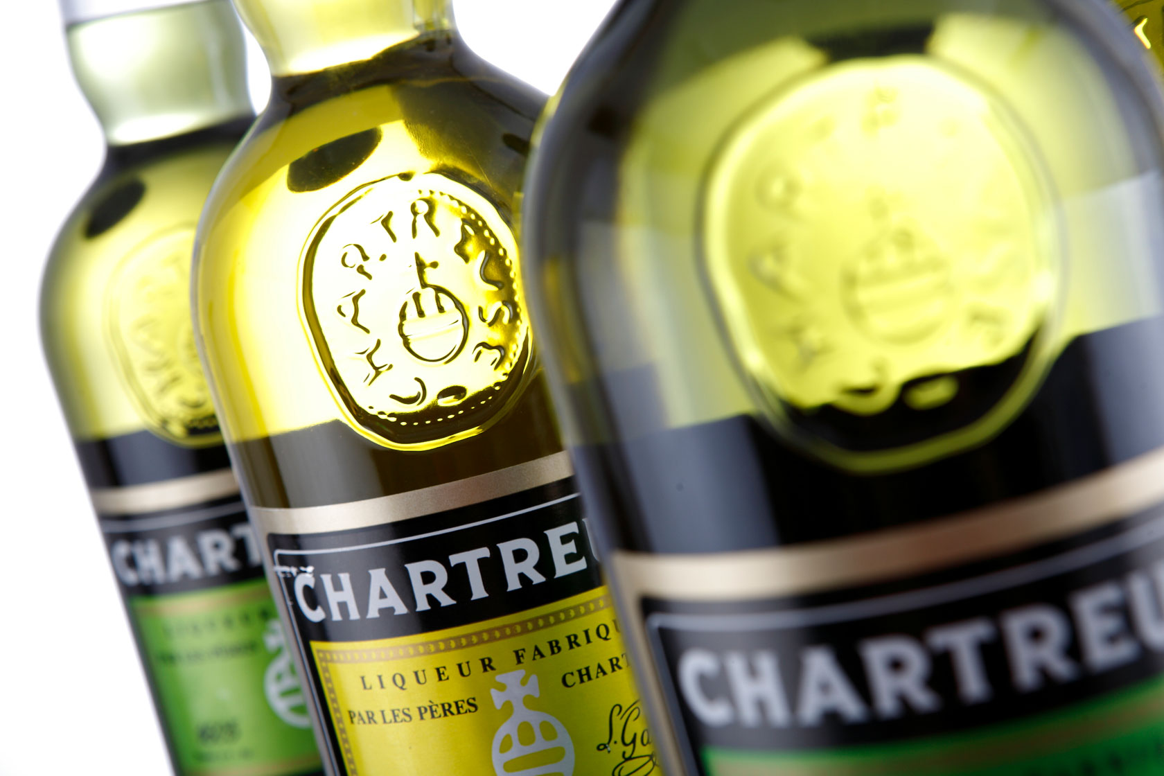
The color chartreuse is named for the liquor. Like orange, which began as a fruit, this sharp and bright shade of green only secondarily became a color. According to legend, and to the Chartreuse official website, in the 17th century, French diplomat and soldier Francois Annibal d’Estrées somehow came into possession of an “already ancient” manuscript that gave instructions on how to make an “Elixir of Long Life.” “The manuscript was probably the work of a 16th century alchemist with a great knowledge of herbs and with the skill to blend, infuse, macerate the 130 of them to form a perfect balanced tonic,” the poorly translated website says. D’Estrées gave this precious scrap of vellum (or paper, but more likely leather) to a group of monks living in a monastery outside Paris. The instructions changed hands a few times. It took over a hundred years for the monks to figure out how to properly brew the potion. But in 1737 they finally created a so-called “elixir of health.”
Over the years, they tweaked the recipe slightly, making it less alcoholic and more palatable to the general public. Then, they began to sell it. This worked fine for everyone involved until 1903, when the French government nationalized the Chartreuse distillery. They expelled the monks, who went to Spain and built a new distillery there. “The pre-expulsion stuff was much prized,” writes Henry Jeffreys for The Guardian. He was introduced to the drink by his “louche uncle.” As Jeffreys relays, the joys of the original version were sung in Evelyn Waugh’s Brideshead Revisited. “There are five distinct tastes as it trickles over the tongue,” Anthony Blanche, Waugh’s stuttering gentleman, says. “It’s like swallowing a sp-spectrum.”
Traditional Chartreuse contains a spectrum of tastes—spicy, bitter, sweet, pungent—but the hue is singular. It’s reminiscent of the green you glimpse in a rainbow or a prism, that impossibly vivid color that sears on your eyeballs. Chartreuse seems to glow.
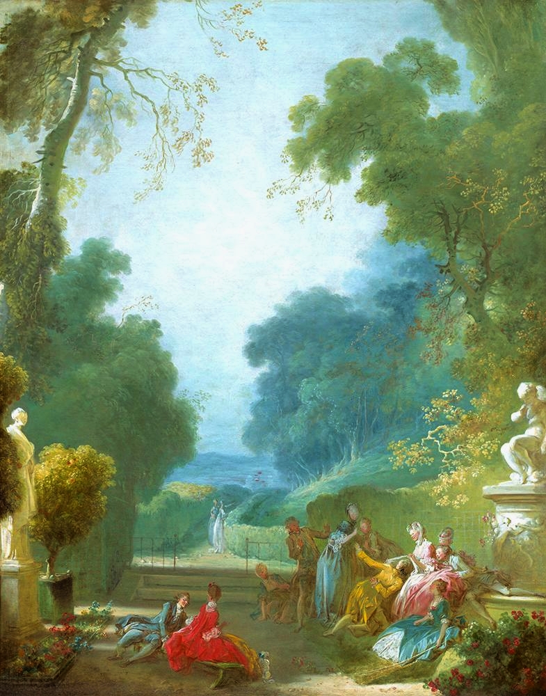
Fragonard, La main chaude. 1775-80
Chartreuse (the color name) was recorded in print for the first time in 1884, according to the Online Etymology Dictionary, but artists had long been using this intense shade to depict the joys and raptures of springtime. Jean-Honore Fragonard was particularly fond of chartreuse. He used it often in his misty yet bright backgrounds. The sharp green made his soft pinks silks and soft pink maidens seem to blush. Van Gogh was also a fan of the lemon-lime shade; Café Terrace at Night uses the hue to heady effect, and the color appears frequently in his paintings from Auvers. From the impressionist movement onward, chartreuse was used to depict both green grass and the city at night. Sometimes, the intense shade seemed ominous, but, in the right light, it could also be read as youthful and joyous,.
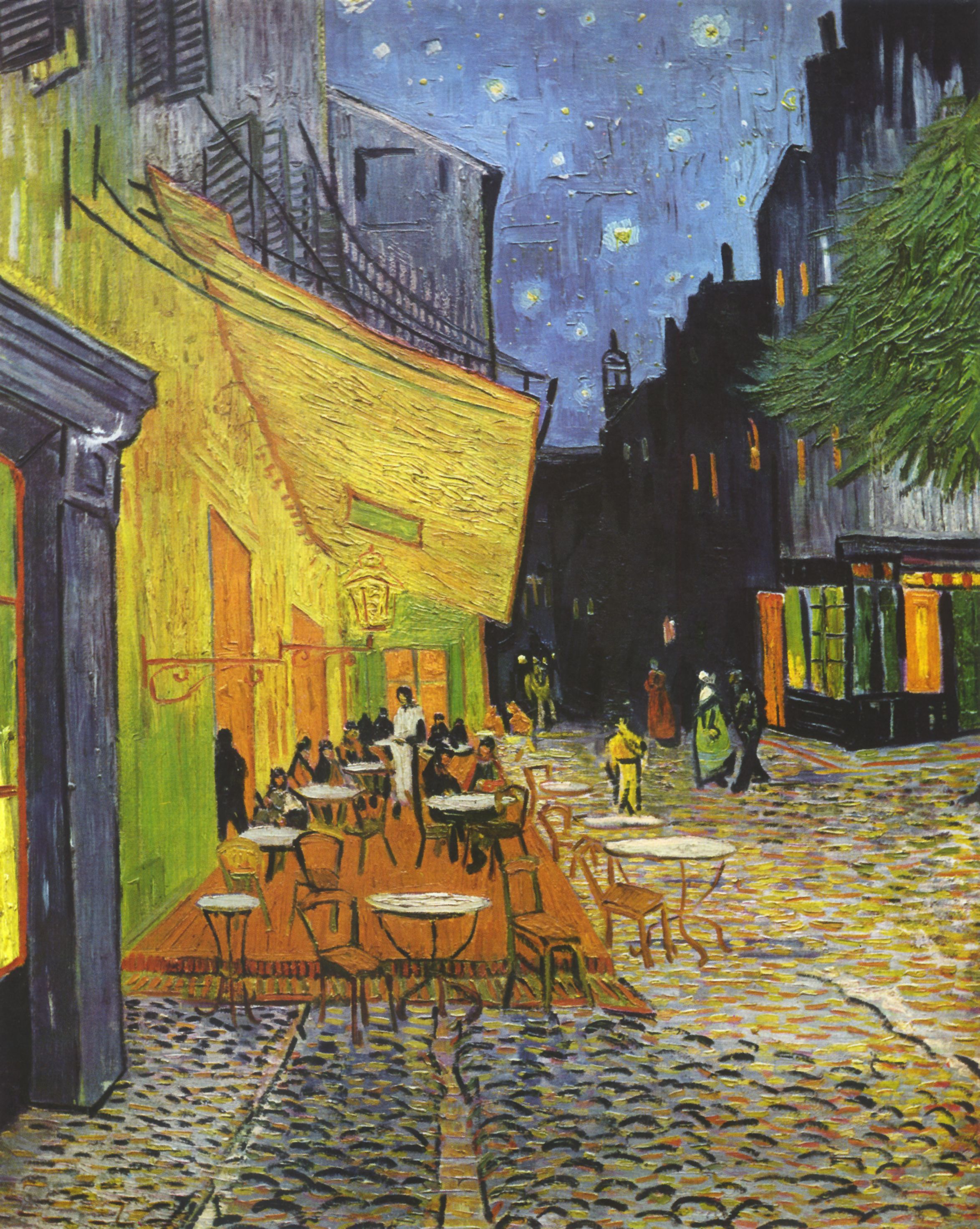
Vincent Van Gogh, Cafe Terrace at Night, 1888
Chartreuse rose to prominence in art; in fashion it leapt in and out. In 1998, the New York Times published an article, “Suddenly, It’s Chartreuse Again,” that included quotes from people on both sides of the chartreuse aisle. Some, like Katell le Bourhis, a research associate at the Costume Institute at the Met, adored the “strident” color. She praised its awakening effect and likened it to “pepper on food.” For Le Bourhis, chartreuse “is the stuff of the 18th century brocades and fresh greenery.” (Le Bourhis herself could often be spotted stalking about the museum wrapped in silk chartreuse scarfs.) The Times also spoke with “noted makeup expert” Pablo Manzoni, who called chartreuse a “miserable color.” “Nobody looks good in it,” he said. “Because of the high condensation of green and yellow, it is lethal, I repeat, lethal. The teeth look yellow. This is just a deadly thing.”
As Times writer Patricia Leigh Brown explains, chartreuse has played an intermittant starring role in fashion since the 18th century. By the late 1800s, chartreuse could be found on feather fans, gowns, purses, shoes, and hats. Then chartreuse was out — the turn of the century was more about emerald green or eau de Nil—two greens that pair more naturally with the art nouveau palette. It returned with a vengeance during the Roaring Twenties. Prohibition-era partiers wore dropped-waist vivid green dresses while they sipped their gin and chartreuse cocktail, The Last Word. According to Harold Koda of the Fashion Institute of Technology, the 1920s were a “hayday of color.” “Influenced by an Orientalist palette, the era saw a profusion of bizarre, extravagant shades reflecting the headiness of the period -fuchsias, maroons and shades of chartreuse — often used as a foil for conservative, simple silhouettes,” summarized Brown.
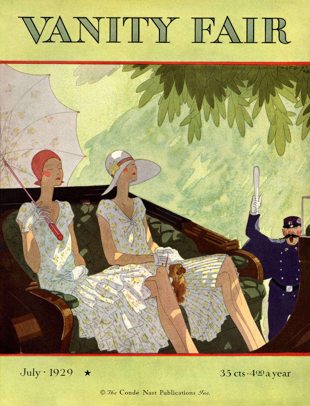
Vanity Fair cover
Chartreuse had several other moments in the limelight. It was big in 1937, and again in the 1960s. It was a favorite of midcentury modern trendsetters, including Finnish furniture designer Eero Saarinen, who created his womb chair (available in “pear”) in 1948. Designers during the hippy era referred to it as “acid green.” The color looks fantastic under a black light, and there was many a chartreuse-colored lava lamp. Brown argues that the “crowning achievement of chartreuse” in the 1960s was probably Balenciaga’s fake fur jackets. In the 1970s, as avocado and harvest gold rose in popularity ,chartreuse fell away again. The 70s were all about earth tones, and while chartreuse can be readily found in nature, it never looks quite natural when used as a dye or paint. There’s an edge to it, and it comes back when people want a bit of pepper, a bit of spice.
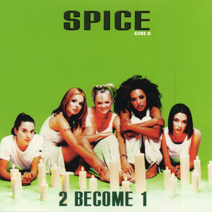
My own petty dislike for chartreuse dates back to the acid green revival of the late 1990s. I was in elementary school when chartreuse came bounding back onto the scene. The trend was hastened by the popularity of the Spice Girls, who loved all things chartreuse, using the hue on their album covers, in their music videos, and wearing it frequently when on tour. I remember seeing the color on all my classmates (though we called it by the less sophisticated name of “lime green”). It was the color of Limited Two, a shop that my mother would never, ever enter. It was too gauche for her tastes, too sexy for little girls, too trendy. She hated the neon yellow smiley faces, the short bright green skirts, the tight ribbed mock-neck sweaters. Ari, a pretty, popular, rich girl in my class, wore almost exclusively Limited Two. I was jealous, and so I began to say I hated Ari’s favorite color, which was (of course) lime green.
I wish I could say that I have grown less petty in adulthood, but I have not. At some point in the past 31 years, I settled on an idea of myself and I am a person who does not like neon. I am a person who likes barn red and Prussian blue and forest greens. If we must go light, give me the colors of a desert, the dusty blushes of Georgia O’Keeffe, the faded sage greens and pale yellows of Agnes Martin. I will accept turquoise, but aqua is too bright. How dare you try and slip blaze orange into my palette — I will revolt.
The fashion powers that be do not agree with me. So-called “highlighter green” and “slime green” (two close relatives of chartreuse) have been popular for the past several years, popping up in collections by Prada, Balenciaga, and Saks Potts and on the willowy Hailey Baldwin, Justin Beiber’s new wife. It was even spotted on proto-influencer North West, who paired her chartreuse pant and crop-top set with a chartreuse scrunchie and itty bitty sunglasses. Like the bright “gen z yellow,” chartreuse has a brashness to it that feels particularly fresh after the pastels of millennial pink and melodramatic lilac. In August, Fashionista asked if “slime green” was “official the color du jour?” “While not exactly flattering,” writer Alyssa Vingan Klein notes, “it’s fun as hell, and will surely grab onlookers’ attention (as well as a significant stream of likes.)”

Some chartreuse selections culled from instagram
But my pettiness is silly. Chartreuse can be appealing, when it’s on an inchworm or an unfurling spring leaf. What’s prettier than a spruce tip in late winter, or a slowly ripening lemon on the bough? I harbor a fondness for chartreuse in art. I see the chartreuse-rich paintings of Joseph Albers and I want to eat those candy greens. The Color Field painters of the mid-twentieth century, Agnes Martin, Ellsworth Kelly, Anne Truitt’s minimalist green columns — those feel like a revelation. Given the right translator, chartreuse stops screaming and begins to hum, singing songs of childhood and nostalgia, periods of growth and joy. But this fondness does not extend to any chartreuse-colored item that I could realistically purchase.
I really adore the other chartreuse, the imaginary one, the one that sounds right but isn’t. You know, that maroon-y red that looks wine-dark and sweet. I long thought that chartreuse was two colors—one red, one green. But it’s not. Chartreuse only refers to the acidic green. There never has been a red chartreuse, but for whatever reason, hordes of people hold dear their memories of this alternative color. For some, the color is nearer to magenta. For others, it’s a brick red.
This phenomenon, where people remember alternative histories seemingly en masse, is known as the Mandela Effect. The term was coined by “paranormal consultant” Fiona Broome in 2010. Broome reported “remembering” the death of South African leader Nelson Mandela in the 1980s, although he was still very much alive. She claimed that this memory was shared by thousands of people, and was solid evidence for alternative timelines and travel between alternative universes. Other pieces of evidence put forth for this theory include the supposed existence of the movie Shazaam (in which Sinbad plays an incompetent genie), The Berenstein Bears (which is actually a children’s book called The Barenstain Bears), Ben Carson’s persistent lies about his college acceptance letters, and memories of alternative logos for breakfast cereals.
But it seems unlikely that we’re living in a Castle Rock-style world where one can fall so easily into another realm (though it would offer a nice explanation for the chaos of the moment). It’s more likely that these are false memories, fortified by interior repetition and exterior confirmation from others. The human memory is inaccurate, and we’re all more susceptible to outside influence than we’d like to admit. The elixir of life will not make you live longer. Alcohol will never be good for you. And chartreuse has always been, and will always be, the color of liquor and lime juice, acid and spring.
Katy Kelleher is a writer who lives in the woods of rural New England with her two dogs and one husband. She is the author of Handcrafted Maine.
from The Paris Review https://ift.tt/2S6eDBT
Comments
Post a Comment