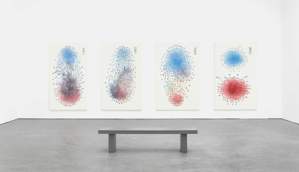
Luc Tuymans, Polarisation—Based on a data visualization by Mauro Martino (2021).
Graphing is the practice of visualizing the abstract—the use of the coordinate plane not to map a territory or to demarcate a two-dimensional surface but to track a measurable quantity across space and time, quantities such as position, velocity, temperature, and brightness. Its invention can be traced to Nicole Oresme, bishop of Lisieux, courtier to Charles V, and scholastic philosopher-polymath who held forth at the College of Navarre of the newly founded University of Paris. His Tractatus de configurationibus qualitatum et motuum (Treatise on the Configurations of Qualities and Motions) from 1353 lays out early versions of what we now call functions and the x and y axes, which he referred to as “longitude” (the axis of the independent variable) and “latitude” (the perpendicular axis for plotting the values of the dependent variable). What made these pictures not merely illustrational but statistical “graphs” was Oresme’s radical insistence on presenting the variables in accurate ratio, with some accord of scale between the unit of measurement and the object or subject or process being measured. His key principle, at least when it comes to the visual, is: “The measure of intensities can be fittingly imagined as the measure of lines.”
Not content to have merely created graphing, Oresme also speculated about creating graphs of graphs, so-called complementary graphing that goes beyond the charting of an individual phenomenon into the charting of the relationships between sets or groups of multiple phenomena, an innovation that took the statistical combination of algebra and geometry just up to the border of what would become modern calculus.
It’s striking to note what phenomena—and what relationships—Oresme thought worthy of graphing. His examples include motion and heat and cold, but also varying definitions and degrees of the qualitative, including grief or sorrow, in effect prophesying the future of infographics, which don’t purport to measure just production, consumption, price fluctuations, or the orbits of stars, but also the ebb and flow of human opinion.
This is a profoundly contemporary desire, to metricize and parameterize our own thoughts and emotions, and to create dynamic models from those standards to show—to make seeable—our social and political life.
***
In 2015, a team of six American academics published “The Rise of Partisanship and Super-Cooperators in the U.S. House of Representatives” in the journal PLOS ONE. The paper made its rounds on the eve of an especially fraught U.S. presidential election season—at a time of so-called fake news and faker outrage, when, as the paper’s abstract deadpanned, “It is widely reported that partisanship in the United States Congress is at an historic high.”
As Donald Trump might say: “People are talking … I’m hearing things …”
The paper endeavored to test this “widely reported” hypothesis and understand its bases. In doing so, it took as a given that in the U.S. Congress in general, and in the House of Representatives in particular, “individuals are persuaded to follow party lines while having the opportunity and incentives to collaborate with members of the opposite party.” In the hopes of “measur[ing] the extent to which legislators tend to form ideological relationships with members of the opposite party,” the paper proceeded to quantify this level of cooperation, or lack of cooperation, between House Democrats and House Republicans between 1949, under the Truman administration, and 2012, under Obama.
I’ll continue to quote:
Each member of the U.S. House of Representatives from 1949–2012 is drawn as a single node. Republican (R) representatives are in red and Democrat (D) representatives are in blue, party affiliation changes are not reflected. Edges are drawn between members who agree above the Congress’ threshold value of votes. The threshold value is the number of agreements where any pair exhibiting this number of agreements is equally likely to [be] comprised of two members of the same party (e.g. DD or RR), or a crossparty pair (e.g. DR). Each node is sized relative to its total number of connections; edges are thicker if the pair agrees on more votes … We define a network of over 5 million pairs of representatives, and compare the mutual agreement rates on legislative decisions between two distinct types of pairs: those from the same party and those formed of members from different parties. We find that despite short-term fluctuations, partisanship or noncooperation in the U.S. Congress has been increasing exponentially for over 60 years with no sign of abating or reversing.
The findings of this study were visualized—they were turned into graphs—by a data scientist named Mauro Martino of IBM Watson, whose red-and-blue (or red, white, and blue) work formed the source for Luc Tuymans’s Polarisation—Based on a data visualization by Mauro Martino, a massive painting from 2021.
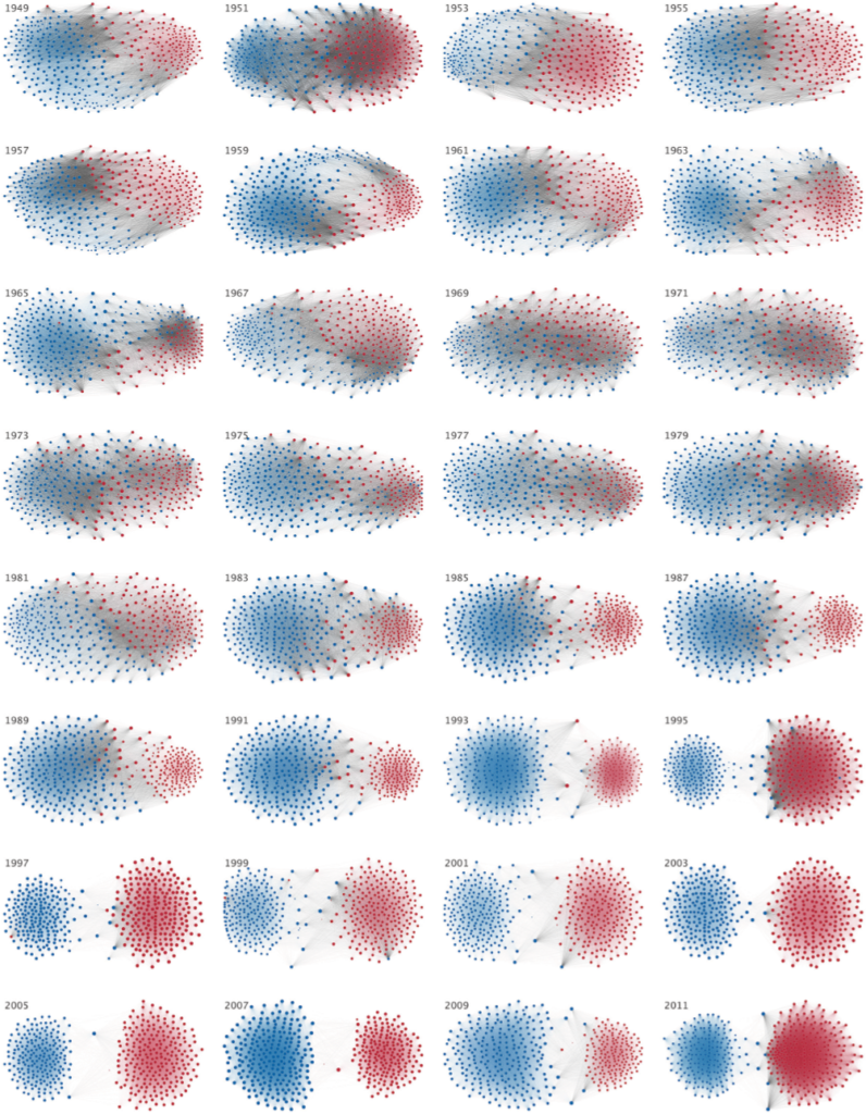
Division of Democrat and Republican Party Members Over Time,
visualization by Mauro Martino, from “The Rise of Partisanship and
Super-Cooperators in the U.S. House of Representatives” (2015).
***
Another experiment: try to forget everything you’ve just read about the origins of this painting (or paintings, plural, as Tuymans has sometimes said) and just look. Polarisation comprises four panels dotted with red and blue pools surrounded—or shrouded—by all the purple-gray shades that red and blue can argue over. Each panel has a date: 1951, 1967, 1989, 2011, and the alignment of the dates on the canvases shows that the paintings are hung at a ninety-degree tilt, the horizontal becoming the vertical, landscape turned to portrait.
Even without any image or inkling of the source material, it should still be clear that these canvases are, or depict, graphs, though at a scale that far exceeds that of the survey-and-poll-results scatter diagrams that fill the media. Tuymans’s renderings are monumental, epic rectangular suspensions of whiteness populated at their centers with red and blue nodes whose atomic or molecular attractions and repulsions have aggregated them into clusters. That these clusters come to reflect one another vertically suggests, to me at least, the rounded volumes of the human form: top half the head, bottom half the torso; the crude circles of the body politic being stretched and compressed, enlarged and shrunken, and then, ultimately, dissevered. Follow the panels chronologically and watch how their centrifugal coagulations draw apart; watch how they diffuse and disintegrate, as their cloudy density gives way and what was once connected becomes tenuous, attenuated, partisan. A rift is being created, an unbridgeable divide, until even the foggy gray contrails that’d crossed the aisle break off and dissipate and fade into the background whiteness, performing this work’s most subtle “illustration”: the gradual elimination of gray (cross-party collaboration, compromise, ambivalence, ambiguity) through the failure of our extremities to communicate.
The year 1951, perhaps only because it’s 1951, looks to me like outer space, the next frontier, a cosmos stretching out unbounded. By 1967, that cosmos has been strained through generational change, with the counterculture trying to drag the old into the new while refusing to accept or even acknowledge the persistence of tradition, which willful ignorance is already inculcating a counterreaction of resentment. In 1989, the gap widens unto rupture and inequality reigns, leaving the range between red and blue a lonely barren, a middle-class no-man’s-land, bereft. By 2011, the withdrawal is complete, the disengagement total; the positions have retrenched into polarized identities—parties turned tribes—and terminally hardened.
***
Though Tuymans has not explained—perhaps not even to himself—why he chose to paint those four years specifically, he has mentioned the significance of the year in which he chose to paint them: 2021, in the wake of another contentious (and falsely contested) U.S. presidential election, which marked the world’s slow emergence from the plague and lockdown that most of us prefer not to discuss or even remember. It’s impossible—it’s impossible for me—to look at this work and the date of its making and not think of COVID-19: the rallies railing against the closing of schools and places of business and worship; the right-wing protests over government overreach; the left-wing protests over the overreach—the lethal violence—of police; the masking that worked, or that didn’t work, depending on the news source; the curve that wouldn’t be flattened; the daily graph-delivered updates on infection and mortality rates cross-referenced according to age, gender, race, income bracket, and all manner of compounding intersectionalities; and last but not least, the famous computer mockups of the novel coronavirus’ virion itself, that motley lottery ball bouncing around, seeking attachments with its fuzzy coronae.
Polarisation was first exhibited in Oresme’s city, Paris, and it is Paris that gave me the sense of its painterly pedigree. Pointillism, like its related color discipline of divisionism, is a period style that I wouldn’t have otherwise associated with Tuymans’s often bleached-out or grayscale work, but one day while wandering around the Musée d’Orsay I was reminded that Georges Seurat originally called his technique “chromoluminarism”—an unwieldy term employed to indicate the primary importance not of the dots themselves but of the light let in between them, the nullities or voids that bring the luminosity and encourage the eye to assimilate the dots into masses, movements, greater constituencies. Tuymans’s Polarisation takes this technique to the nth degree, by presenting a literal congress of dots that make no figure, atop a screen of light that has been wrenched apart into the gaping, ragged chasm of a schism.
Joshua Cohen was awarded the Pulitzer Prize in Fiction for The Netanyahus: An Account of a Minor and Ultimately Even Negligible Episode in the History of a Very Famous Family.
from The Paris Review https://ift.tt/i83ucja
Comments
Post a Comment