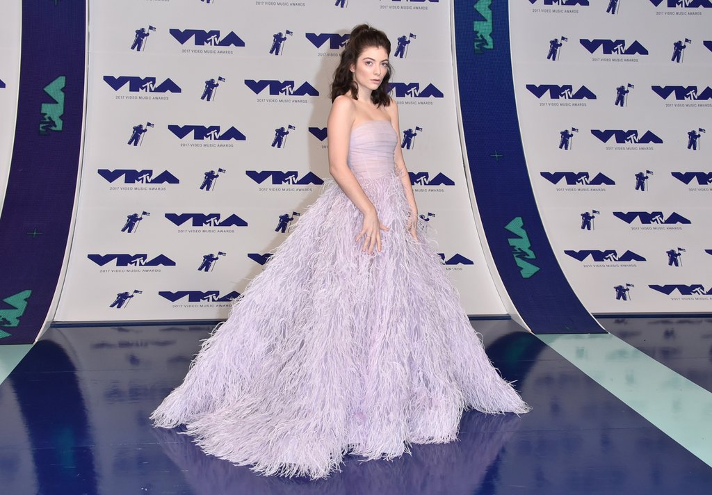
Lorde at the Video Music Awards
In 1960, architect John Macsai cracked open a book of brick samples to show his employer, A.N. Pritzker. Pritzker was, according to The Chicago Reader, an “incomprehensibly wealthy” man who wanted Mascai to build him a hotel. The building would be the first Hyatt Hotel in the Midwest. Mascai had already drafted up the shape of the structure. It was going to be a subtly striking building, a fine example of midcentury modern style, perched on short stilts in downtown Lincolnwood, Illinois. Mascai’s plans called for a long, low-slung building with the main structural elements, like the supporting steel beams, placed on the outside, allowing for extra large rooms on the inside. Like most design of the era, it emphasized function and comfort equally, with few decorative touches (and certainly no Morris-esque flourishes). Macsai wanted to use gray bricks and white-painted steel for the hotel’s facade. But Pritzker had other ideas. The gray, he said, was “dull.” He was a man with more dollars than sense, and he didn’t want something tasteful or subdued. He wanted to build something that would stand out, that would trumpet its existence to pedestrians from a mile away.
And so, after pawing through the sample book, Pritzker picked out a purple glazed brick. He didn’t pick a deep purple, or one of those obscure dark maroons that can read as brown in the right light, and he didn’t choose a soft gray-leaning mauve either. He picked lilac. A shade darker than thistle and lighter than mulberry. A shade that is undeniably purple, even at dusk, even at dawn.

Purple Hotel, photograph by Chris Bentley
The Lincolnwood Hyatt became infamous. Like bankruptcy or falling in love, this happened both gradually and then all at once. At first, the hotel was a respectable entry in a respectable chain, but soon the lilac exterior began to work its magic. It went from being a Hyatt to a Radisson to a Ramada, until it was finely granted the right to go by its true name and was rechristened “The Purple Hotel.”
“It stands out,” said Gwen Macsai, John Macsai’s daughter, on an episode of 99 Percent Invisible. “Depending on how you look at it, like a prized jewel or a sore thumb.” The famous and the wealthy slumbered behind the glazed lilac bricks, people like Barry Manilow, Perry Como, and Michael Jordan. The décor, which was swank for the 1960s, soon began to look dated, seedy and rundown. By 1983 its reputation was already in the gutter, but the murder of known mafia man Allen Dorfman in the parking lot (with a revolver) sealed the hotel’s fate. By the dawn of the new millennia, the “hotel was synonymous with sleaze,” writes Ken Fager at American Urbex. “Police were frequently summoned to the hotel for drug and prostitution related offences.” It was the home of the Midwest Fetish Fair and Marketplace convention and it became a favorite tryst spot for philandering politicos. The Purple Hotel closed in January 2007 due to health code violations. Despite some efforts to save the building, it was demolished a few years later.
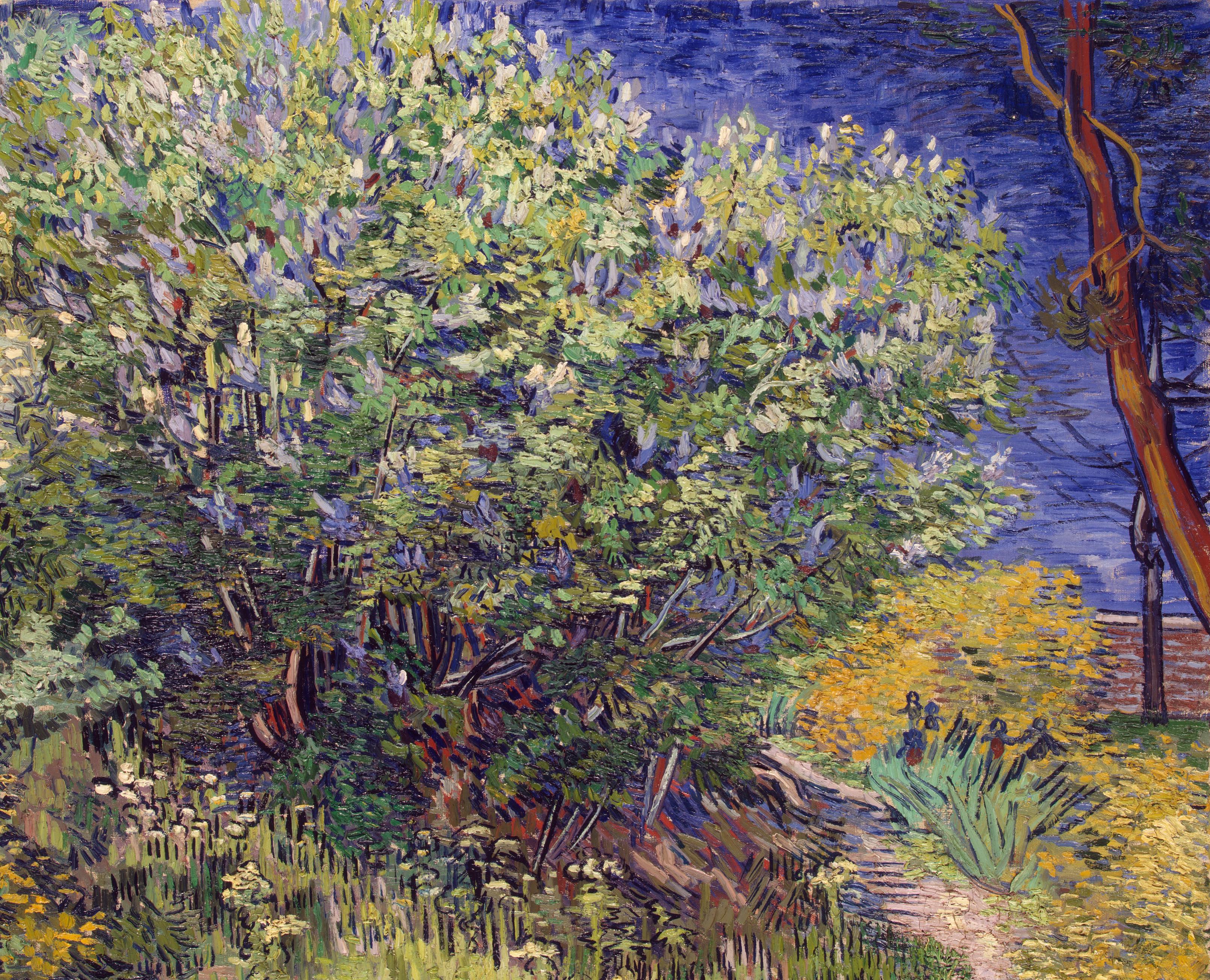
Vincent Van Gogh, Lilac Bushes
Depending on whom you ask, the lilac façade was hideous or cool, chic or ugly-chic, sordid or whimsical, or as tacky as a gold plated toilet. I love the story of the Purple Hotel, partially because I think ugliness is underrated, but also because it’s such a purple tale. What other color sparks such divisive reactions? What other color seems at once so unfitting for a chic hotel and so destined to pique interest?
Lilac is a color choice that always feels slightly suspect. There is a time and a place for green, blue, yellow, and red. These primary and secondary colors each have an established role in the world of design and consumer goods. Cars look good in red and houses look nice painted yellow. Blue is a good color for bedding, and green is a fine color for a sofa, a kitchen, or a travel mug. If you show up to a party wearing a blue tie, no one questions your taste; blue is a default, a near-neutral. Pink has slowly inch-wormed its way into neutral territory. But purple has never made that move. It can’t. It’s too singular. Purple outfits are for pimps or bested politicians trying to signify unity, and purple cars are for radio DJs trying to jumpstart some brand recognition. It’s a color associated with spirituality, creativity, and royalty, sure, but purple (and bright purple especially) is also the color of kookiness and wacky aunts.
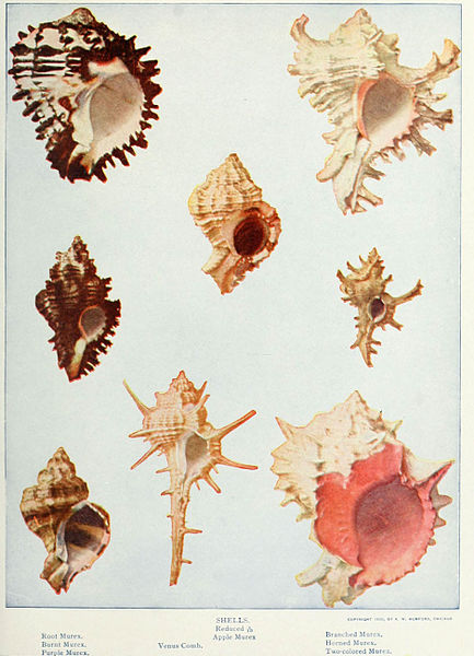
Murex Snails
Within the purple color family, there are clear winners and losers. Tyrian purple (i.e. “Royal purple”) is the king of the bunch. Its reign is long-lasting and dates back to the ancients. As early as 1570 BC, coast-dwelling Phoenicians figured out that they could milk murex snails to produce a purple secretion, which they used to dye their clothes an intense violet shade. Centuries later, Cleopatra’s servants would spend hours messaging predatory sea snails for their luxury-loving queen. Tyrian Purple was prized by the Romans and in his Natural History, Pliny the Elder described at great lengths the process of extracting the “juice,” boiling down the dye, and submerging the wool. This mollusk-based color was so expensive and difficult to make that it naturally became associated with royalty and later, clergy members. Although typically seen as a vivid and bold color, Tyrian purple dye could also be used to make lilac gowns and lavender togas, depending on the strength of the dye.
For those who couldn’t afford murex-based dyes, there was always orchil. Made from lichen, this was the “poor man’s purple.” It was redder than Tyrian purple, and producing this bright color involved seeping the plant in buckets of “stale urine” for weeks. According to some sources, orchil is an older form of purple dye than Tyrian. The use of orchil spread throughout Europe, and even the Vikings got on board—it’s strange to imagine them raping and pillaging while wearing bright fuchsia tunics, but it seems likely that they did. People still make orchil today, but it’s a hobby mostly reserved for plant nerds and dye-hards. And of course, no history of purple is complete without at least a mention of mauve, the revolutionary compound accidentally discovered in 1859 by chemist William Henry Perkin (but that’s a story for another day).
Whither lilac, you may be asking. Well, lilac is the redheaded stepchild of the purple family. It’s not bright like amethyst or chic like mauve. It’s the color of doomed hotels, Nantucket in the off-season, dentistry, Elizabeth Taylor’s eyes, and Victorian “half-mourning.” But right now, after decades of gray dominance and a few years of Millennial pink madness, both lilac and lavender (that slightly grayer herbal hue) are suddenly in the limelight.
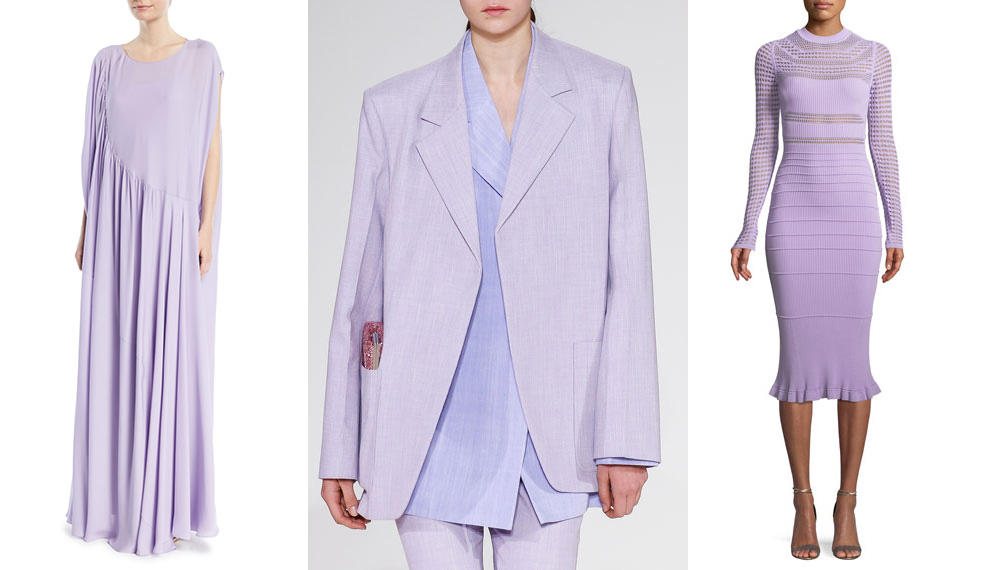
Some trendy lilac clothes (The Row, Victoria Beck
It’s hard to pinpoint exactly where one color starts and another begins, which is perhaps why Millennial pinks is such an appealing color term. It’s a catchall for a trend, one promoted and seemingly coined by The Cut (New York magazine’s fashion and lifestyle vertical). A few weeks ago, the same site posted a fun and useful guide to dressing in “Melodramatic purple,” inspired by Lorde’s MTV Music Video Awards gown. Melodramatic purple is a term that stretches to fit mauve-ish lavenders and pink-leaning lilacs. It’s also a color that, as the name suggests, vibrates with emotional resonance. Emilia Petrarca writes that it has “All the feels… In simple terms, it’s both sad and happy at the same time, a state of being I think a lot of people can relate to for spring 2018.”

Władysław Czachórski, Lady in a Lilac Dress, 1880-1890
In the 1800s, widows wore lilac when they were almost done memorializing the loss of their husbands. In both the Victorian and Edwardian eras, mourners were bound by strict rules of etiquette. For the first phase, they would wear black wool dresses trimmed with crepe. “Neither velvet, satin, nor plush can be worn in mourning,” prescribed the Collier’s Cyclopedia in 1901. After a full year had passed, the bereaved could wear white, lilac, lavender, as well as more decadent fabrics. Fortunately, according to Collier’s, if it was your mother-in-law who passed, you only had to wait one moth before getting out the lilac gown.

Stephanie A. Gregory Clifford, known professionally as Stormy Daniels
While my mother-in-law is still very much alive, I deeply relate to both the feeling of being in “half-mourning” and the desire to wear lilac. At first, I was resistant to the purple color creep, which started with this year’s Pantone of Ultra Violet and subtly spread through repeated exposure in spring 2018 runway shows. The stylized beauty and “claustrophobic elegance” of Paul Thomas Anderson’s Phantom Thread helped seal the deal. Media coverage has been a factor, too. InStyle UK credited designer-slash-former Spice Gal Victoria Beckham for starting the trend, dubbing lilac the “color of SS2018” (that’s spring/summer for those uninitiated in fashion-speak). Balenciaga also came out swinging for lilac—their spring/summer line even makes the case for light purple menswear. Refinery 29 named purple one of the “six color trends we’re buying this spring” and Who What Wear argued that light purple is the “one 2018 trend you can’t ignore.” But perhaps my biggest point of reference has been Stormy Daniels and her lilac suits. Here’s a woman who has bared everything for the sake of her country (and to defend her reputation), striding bravely into a courtroom to take down a bunch of crooks. For this triumphant yet tragic moment, she chose to wear lilac, a bipartisan shade (neither democrat blue or republican red) with a distinctly feminine twist. The whole sordid Trump/Daniels story has been entertaining for some, but at its core, it’s really just melodramatic. And yet, like a bruise that you just can’t stop pressing, I can’t seem to look away from this painful spectacle. The country is stuck in a phase of half-mourning, and what better shade to wear than a moody pastel, half-hopeful, half-gaudy.
Read more in our Hue’s Hue series.
Katy Kelleher is a writer who lives in the woods of rural New England. She is the author of Handcrafted Maine.
from The Paris Review https://ift.tt/2ryjhfA
Comments
Post a Comment